🎉 We just launched 3 new features! Find out more:

Debugger
AI Translation
AI Rephrase
blog single image
blog single image
Product-Led Growth

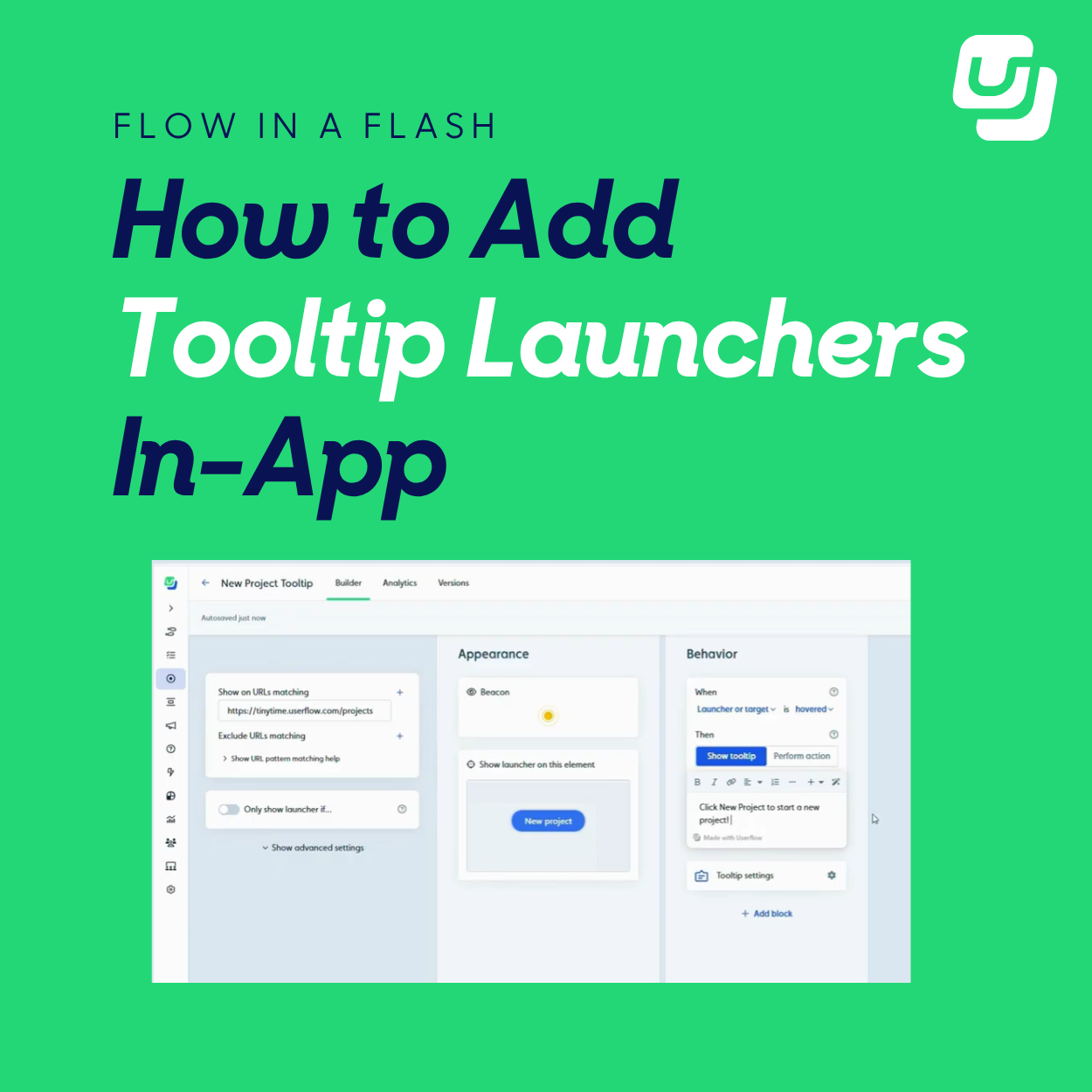
How to Add Tooltip Launchers for Smarter In-App Guidance

blog author
Jinwoo Park

November 11, 2025

Tooltips are powerful for guiding users, but sometimes they can feel a little too visible. If you want a more subtle, elegant way to deliver help right where users need it, tooltip launchers are your answer. In this quick workflow, you’ll learn how to create beacon-style launchers in Userflow that deliver contextual guidance without overwhelming your UI.

Why This Flow is Useful

  • Provides help without overwhelming users with constant tooltips.

  • Makes onboarding feel natural and user-led.

  • Keeps your product UI clean while still offering in-context support.

  • Drives faster feature adoption with minimal friction.

Step-by-Step: How It Works

1. Open Launchers in Userflow

Head to the Launchers section of your Userflow dashboard.

Why this matters: Launchers let you trigger tooltips, flows, or help content directly from subtle icons or beacons placed inside your product.

2. Create a new launcher

Click Create Launcher and give it a clear name such as “New Project Tooltip.”

Why this matters: Descriptive naming helps you quickly manage and reuse launchers across pages.

3. Assign the target page

Enter the URL where you want your launcher to appear.

Why this matters: This ensures the tooltip only shows up in the right context where it’s most relevant to the user.

4. Choose your launcher style

Select the Beacon option for a clean, subtle hover indicator (you can also choose icons, buttons, or hidden launchers).

Why this matters: Beacons gently draw attention without interrupting the user experience.

5. Position the beacon

Travel to the target page and click the button or element where you want the beacon to appear.

Why this matters: Proper placement makes sure users discover the tooltip naturally, right where help is needed.

6. Set your trigger behavior

Choose whether the tooltip appears on hover or click. In this example, we’ll go with hover.

Why this matters: Hover triggers are great for quick guidance, while click triggers encourage deliberate exploration.

7. Write your tooltip content

Add your helpful message—for example: “Click New Project to start a new project.”

Why this matters: Clear, concise messaging helps users take action immediately.

8. Preview and test

Hit Preview to make sure the beacon appears correctly and the tooltip activates on hover.

Why this matters: Testing ensures a smooth user experience before you roll it out live.

Pro Tips On Tooltip Launchers

Here's how you can level up the effectiveness of those launchers even more.

  • Use beacons sparingly. Too many and they lose impact.

  • Write tooltips in action-oriented language (e.g., “Click here to…”).

  • Combine launchers with analytics to track engagement and improvement.

  • Test different trigger types (hover vs click) to match user behavior.

  • Refresh tooltip content regularly as your product evolves.

Try It Yourself

Give your in-app guidance a more polished, user-friendly touch. Add tooltip launchers that inform without interrupting and make self-service onboarding smarter.

Sign up for Userflow

2 min 33 sec. read

Tooltips are powerful for guiding users, but sometimes they can feel a little too visible. If you want a more subtle, elegant way to deliver help right where users need it, tooltip launchers are your answer. In this quick workflow, you’ll learn how to create beacon-style launchers in Userflow that deliver contextual guidance without overwhelming your UI.

Why This Flow is Useful

  • Provides help without overwhelming users with constant tooltips.

  • Makes onboarding feel natural and user-led.

  • Keeps your product UI clean while still offering in-context support.

  • Drives faster feature adoption with minimal friction.

Step-by-Step: How It Works

1. Open Launchers in Userflow

Head to the Launchers section of your Userflow dashboard.

Why this matters: Launchers let you trigger tooltips, flows, or help content directly from subtle icons or beacons placed inside your product.

2. Create a new launcher

Click Create Launcher and give it a clear name such as “New Project Tooltip.”

Why this matters: Descriptive naming helps you quickly manage and reuse launchers across pages.

3. Assign the target page

Enter the URL where you want your launcher to appear.

Why this matters: This ensures the tooltip only shows up in the right context where it’s most relevant to the user.

4. Choose your launcher style

Select the Beacon option for a clean, subtle hover indicator (you can also choose icons, buttons, or hidden launchers).

Why this matters: Beacons gently draw attention without interrupting the user experience.

5. Position the beacon

Travel to the target page and click the button or element where you want the beacon to appear.

Why this matters: Proper placement makes sure users discover the tooltip naturally, right where help is needed.

6. Set your trigger behavior

Choose whether the tooltip appears on hover or click. In this example, we’ll go with hover.

Why this matters: Hover triggers are great for quick guidance, while click triggers encourage deliberate exploration.

7. Write your tooltip content

Add your helpful message—for example: “Click New Project to start a new project.”

Why this matters: Clear, concise messaging helps users take action immediately.

8. Preview and test

Hit Preview to make sure the beacon appears correctly and the tooltip activates on hover.

Why this matters: Testing ensures a smooth user experience before you roll it out live.

Pro Tips On Tooltip Launchers

Here's how you can level up the effectiveness of those launchers even more.

  • Use beacons sparingly. Too many and they lose impact.

  • Write tooltips in action-oriented language (e.g., “Click here to…”).

  • Combine launchers with analytics to track engagement and improvement.

  • Test different trigger types (hover vs click) to match user behavior.

  • Refresh tooltip content regularly as your product evolves.

Try It Yourself

Give your in-app guidance a more polished, user-friendly touch. Add tooltip launchers that inform without interrupting and make self-service onboarding smarter.

Sign up for Userflow

About the author

blog author
Jinwoo Park

Userflow

Content Marketing Manager at Userflow

Jinwoo Park leads content strategy at Userflow, where he writes about onboarding, user engagement, and product-led growth. His work blends storytelling and strategy to help SaaS teams design smoother onboarding experiences and build products users love from day one. He holds a master’s in Creative Writing from the University of Oxford and is also a published novelist.

Effortless Onboarding,
Powerful Results

Try the most-loved user onboarding product on the market.

CASE STUDIES

All case studies
iconicon

Klevu

a case study

How Klevu Enhanced Adoption and Reduced Time-to-Value by 50% with Userflow

Learn how
iconicon

Evocalize

a case study

How Evocalize Boosted Product Adoption and Engagement With Userflow 

Learn how
iconicon

Visma Dinero

a case study

How Visma Dinero provides 24/7 onboarding and support with in-app content and AI Assistant.

Learn how
iconicon